Colors can be used and interpreted in various different ways. The right use of colors is a vital asset for a successful film.
Different colors have different meanings. However, the meanings of each colors could change depending on the situation and the location. For example, orangey-yellow is often seen in houses and/or hotel scenes. This emphasizes the idea of home, warmth, family, and nostalgia. However, when the same orangey-yellow is used in a Dystopian movie, the mood and tone changes almost instantly. The colors are there to represent toxic air, dust, and danger.


Another example is green. Green usually represent lush, fertility, grace, and is overall an eye-resting color scheme. However, green could as well represents danger, disease, chaos, and if on a person - evil.

This is a chart I found from studiobinder.com on how different colors give different mood and tone to help emphasize the idea:
There are Different types of color schemes used in cinematography
1) Complementary Colors
Complementary colors are colors which are directly opposite from each other on the color wheel. For example; purple and yellow, blue and orange, Green and red. This type of color use is often used in scenes where there are clear opposition between two force or characters (Good and evil)
2) Analogous Colors + Monochromatic
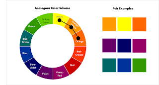
Analogous are colors that are closer together in the color wheel with the same tone. This use of colors often represent unanimous and like-minded. Monochromatic, on the other hand, tend to be more dull and sometimes indicates harmony
3) Triadic Colors
Triadic colors represents a balanced setting. This sometimes help viewers have a place to place their eyes.
4) Discordant Colors
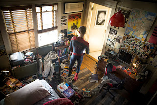
Colors which is not in the corresponding pair tends to draw viewers' attention towards them. A blue diamond against the monochromatic red color scheme psychologically attracts viewers attention and therefore, makes them know it is an important information in the scene. This special technique is often used in modern games, where players know instantly which way to go next without being told.
5) Associative colors
Sometimes, certain characters got their own personal color scheme. What colors go you think of when I say Darth Vader? Probably black and red. Mace Vindu from Star Wars was the only Jedi knight with a violet light saber. We know that the light saber is his, and not Luke's blue one. This type of color use also applied to the idea of power rangers and how different colors reflect each of the character's personality traits.
From all the information above, I have tried applying different color schemes onto my own sets of cinematic photography as a practice and for my AS-Level Art coursework. Here are some of the results I got from this fun experiment (Can also be found on my Instagram):
The stills above are taken during our trip to Beijing by me. The monochromatic hue of bluish-green indicates the feeling of loneliness, lost, memory, and nostalgia. It also generates the idea of the characters being thoughtful, wise, and full of inner potential and wisdom. My brothers were very eager to be my model.
The Temple of Heaven and the Forbidden City, on the other hand, gets a more purplish-dusty-brown color scheme. This dry and toxic look therefore emphasize the nasty tales behind the walls of the Imperial Palace and how dangerous it was to live in it. The purplish tone was there to show the grandness and superiority so as the mysteries hidden along in its legend.
(Behind the scene)
In this set, I got myself and my siblings to dress up as tea farmers. The complementary colors of orangey-yellow and the blue costume help create contrast and therefore, furthermore, highlighted the viewers focal area as the characters in the scene instead. This gives viewers an eye-resting point instead of darting around randomly throughout the frame. Same goes with the old house at dusk. The complementary orange light at the red door upon a cool background help draws viewers' attention to the middle of the frame.


No comments:
Post a Comment