Monday, November 28, 2016

Spy-Thriller short film project - Storyboard

We discussed about the sub-genres of Thrillers in class and decided to come up with one as a practice example. Spies seem easy enough for us to work and plan on in a small amount of time.

Below is our initial record of idea and our storyboard drafts:


Sunday, November 27, 2016

SUB GENREs of Thriller

'American Sniper' Opening scene analysis

The opening scene itself foreshadow the dark violence within this film. It serves as a tension builder for viewers to know how horrid war could be. It is certainly not a comedy-war-thriller or any other light mood genres.

To emphasize my point, here are some evidences:

The extreme long shot of the view from an aerial perspective shows a Middle-Eastern city, utterly destroyed by war. This allows viewers to know the setting of this story so as the time it takes place. From what we can see, the film probably takes place either in the Iraq war, or the war against Al-Qaeda.


The camera movements of these two scenes are completely different. The infantry unit kicking open doors were filmed in a handheld technique. This indicates the burning agitation and the crowded commotion the soldiers were going through. However, the shots where the two snipers were taken tends to pan more smoothly and stable. This therefore, indicates that the snipers were calm and harmonious, waiting for whatever target they will be handling. Viewers receive the information that being a sniper means a very inexorable heart - callous - even. 


In this scene, instead of feeling sympathetic towards the main protagonists, viewers are more concerned about the targets of the sniper. A child an a nun were the ones targeted.  This furthermore creates tension and inner controversial feelings whether or not shooting them was the right thing and who, in truth, should be seen as the victim. Instead of using stereotypical terrorist men, the film chose to use children and women... And if the woman was not a nun, viewers might be able to cope better. This use of mise-en-scene therefore, creates internal conflicts between our usual moral code of protecting the weak, and is killing them the only way out of this war - the only way to ensure the US Army's safety? The scene corresponds to the earlier paragraph. Being a sniper can mean merciless acts to ensure that duty is accomplished.


This close-up reaction shot of the main characters after the victims were shot shows that there could be no mercy after all in war (or moreover, in desperate times). People who are well trained like the Navy SEALs needs to be very strong both physically and emotionally. By laughing and calling the nun a 'bitch', shows that the characters has no more respect in religious beliefs, which might as well be what most other people at that time thinks. Praying does not free them from intruders and war.


Thursday, November 24, 2016

Storyboarding experiment - Treasure Island extract scene

I've recently finished a novel called Treasure Island by Robert Louis Stevenson. It is a story of a young boy going off on a treacherous expedition in course to find the legendary treasure island. I absolutely love the book. The childhood, the sense of imagination and adventure all comes back to me. Pirates and buccaneer fights... They are all so intriguing I need to do something about it. Therefore, I decided to work on a storyboard for one of my favorite scenes in order to learn from it and at the same time, satisfy my own needs. Jim Hawkins' and Long John Silver's rough sketches were designed by myself, so as the rough surrounding of the cabin.

I experimented on different camera shots such as Jim's close up reaction shot and Captain Flint - the parrot's view from a high angled shot. It was fun looking at different ways I can successfully develop my story, and at the same time, keep the process interesting to the viewers.

The scene starts off with Jim Hawkins' entrance sequence into the cabin. The long shot of Jim walking into complete darkness with only a trail of moonlight from the door encourages the idea of the boy being trapped in a dark box, not knowing what danger could await him in the shadows...


Adapted from an extract of Robert Louis Stevenson's original piece:

" All was dark within, so that I could distinguish nothing by the eye. As for sounds, there was the steady drone of the snorers and a small occasional noise, a flickering or pecking that I could in no way account for.
With my arms before me I walked steadily in. I should lie down in my own place (I thought with a silent chuckle) and enjoy their faces when they found me in the morning.
My foot struck something yielding--it was a sleeper's leg; and he turned and groaned, but without awaking.
And then, all of a sudden, a shrill voice broke forth out of the darkness:
"Pieces of eight! Pieces of eight! Pieces of eight! Pieces of eight! Pieces of eight! and so forth, without pause or change, like the clacking of a tiny mill.
Silver's green parrot, Captain Flint! It was she whom I had heard pecking at a piece of bark; it was she, keeping better watch than any human being, who thus announced my arrival with her wearisome refrain.
I had no time left me to recover. At the sharp, clipping tone of the parrot, the sleepers awoke and sprang up; and with a mighty oath, the voice of Silver cried, "Who goes?"
I turned to run, struck violently against one person, recoiled, and ran full into the arms of a second, who for his part closed upon and held me tight.
"Bring a torch, Dick," said Silver when my capture was thus assured. " - Treasure Island

Sunday, November 20, 2016

Film Opening Credits Convention

NOTES:


We looked at Panic Room's opening credit sequence. Below are my notes on what I have recognized in the 1:50 minutes of the clip. 


The main Pattern
(The size of fonts shows the importance of the credited)

STUDIO
PRODUCTION COMPANIES
MAIN STARS (CASTS)
TITLE
SUPPORTING CASTS
TECHNICAL/CREATIVE STAFFS
PRODUCERS
WRITER
DIRECTOR

#Having the title coming at the end makes your project resembles a trailer


Friday, November 18, 2016

Zodiac Film Still - Interrogation scene


We were given a task to re-create the Arthur Lee Allen interrogation scene from Zodiac. It is a good opportunity for me to practice color degrading techniques using both Adobe Photoshop and Lightroom. Not only cinematic photography, we also learn to improvise our props - as can be seen below with the post-it Zodiac watch.

Cast:
 Dave Toschi - BammBamm
Arthur Lee Allen - May
Sergeant Jack Mulanax - Michelle
Anthony Edward William Armstrong - Me
Director and  original photographer - Saimink
Cinematic Photography editing - Me


Original Extract Clip:


"Can I see your watch?"


Cinematic Photography and the use of colors in films


Colors can be used and interpreted in various different ways. The right use of colors is a vital asset for a successful film.


Different colors have different meanings. However, the meanings of each colors could change depending on the situation and the location. For example, orangey-yellow is often seen in houses and/or hotel scenes. This emphasizes the idea of home, warmth, family, and nostalgia. However, when the same orangey-yellow is used in a Dystopian movie, the mood and tone changes almost instantly. The colors are there to represent toxic air, dust, and danger.


Another example is green. Green usually represent lush, fertility, grace, and is overall an eye-resting color scheme. However, green could as well represents danger, disease, chaos, and if on a person - evil.


This is a chart I found from studiobinder.com on how different colors give different mood and tone to help emphasize the idea:


There are Different types of color schemes used in cinematography

1) Complementary Colors
Complementary colors are colors which are directly opposite from each other on the color wheel. For example; purple and yellow, blue and orange, Green and red. This type of color use is often used in scenes where there are clear opposition between two force or characters (Good and evil)


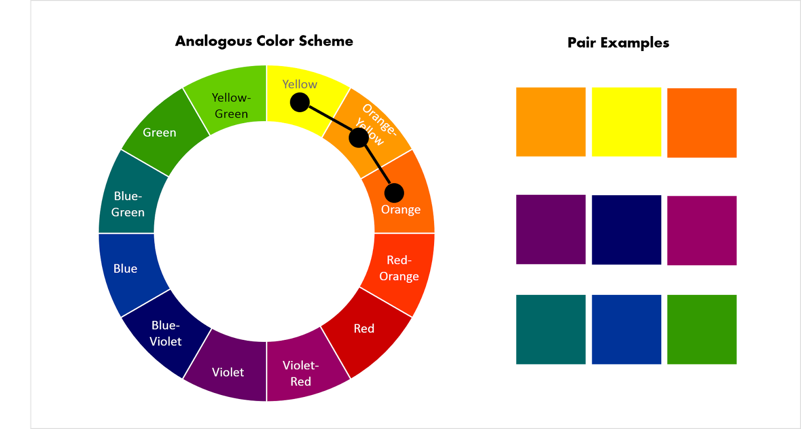
2) Analogous Colors + Monochromatic
Analogous are colors that are closer together in the color wheel with the same tone. This use of colors often represent unanimous and like-minded. Monochromatic, on the other hand, tend to be more dull and sometimes indicates harmony


3) Triadic Colors
Triadic colors represents a balanced setting. This sometimes help viewers have a place to place their eyes.


4) Discordant Colors
Colors which is not in the corresponding pair tends to draw viewers' attention towards them. A blue diamond against the monochromatic red color scheme psychologically attracts viewers attention and therefore, makes them know it is an important information in the scene. This special technique is often used in modern games, where players know instantly which way to go next without being told.


5) Associative colors 
Sometimes, certain characters got their own personal color scheme. What colors go you think of when I say Darth Vader? Probably black and red. Mace Vindu from Star Wars was the only Jedi knight with a violet light saber. We know that the light saber is his, and not Luke's blue one. This type of color use also applied to the idea of power rangers and how different colors reflect each of the character's personality traits.


From all the information above, I have tried applying different color schemes onto my own sets of cinematic photography as a practice and for my AS-Level Art coursework. Here are some of the results I got from this fun experiment (Can also be found on my Instagram):


The stills above are taken during our trip to Beijing by me. The monochromatic hue of bluish-green indicates the feeling of loneliness, lost, memory, and nostalgia. It also generates the idea of the characters being thoughtful, wise, and full of inner potential and wisdom. My brothers were very eager to be my model.


The Temple of Heaven and the Forbidden City, on the other hand, gets a more purplish-dusty-brown color scheme. This dry and toxic look therefore emphasize the nasty tales behind the walls of the Imperial Palace and how dangerous it was to live in it. The purplish tone was there to show the grandness and superiority so as the mysteries hidden along in its legend.
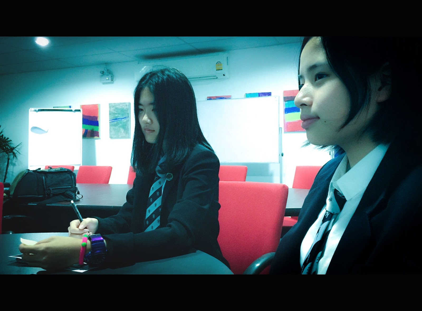


(Behind the scene)


In this set, I got myself and my siblings to dress up as tea farmers. The complementary colors of orangey-yellow and the blue costume help create contrast and therefore, furthermore, highlighted the viewers focal area as the characters in the scene instead. This gives viewers an eye-resting point instead of darting around randomly throughout the frame. Same goes with the old house at dusk. The complementary orange light at the red door upon a cool background help draws viewers' attention to the middle of the frame.


 This next set was taken at Chatuchak. The triadic color used in the photos are green, red, and blue. The red of my shirt, however, served as a discordant asset to the scenes, contrasting from the duller colors in the background. The many colors used represent the chaos of Bangkok most famous street market. Although each person wear different colors, my vibrant red still stands out among the rest.


Information Reference: https://www.studiobinder.com/blog/how-to-use-color-in-film-50-examples-of-movie-color-palettes/