Wednesday, February 1, 2017

Deciding on the Credits' font

I had to redo the credits over and over again. Firstly, the original font that I use as a guide line does not look professional enough. A few of my friends commented that it is out of style and very old fashioned - doesn't suit my theme. Therefore, my teacher advised me to try and write my own font. I browsed through several tutorials on YouTube as well as looked through some of my piers' works. Below is the tutorial I used:


Instead of drawing on a white board, I used Adobe Photoshop and Wacom Pad instead. This makes it easier to transfer the files onto Premiere Pro without having to take a video of the writings and then uploading it onto Dropbox.


However, when my father got home that day, he commented that the font I drew was funny and was 'crappy'. He said it looked as if I didn't put my heart into it. I cried after hearing that, since I've spent the whole day making (drawing) those hundred flickering credits and single-handedly put them in Premiere Pro frame by frame. He said I could improve it by downloading a more universal font. He advised Times New Romans... But to be honest, I'm sick of using that font. 

He also told me that the flickering made the words harder to read. I cried even harder because I sacrificed all of my free time that day to work on the animation. After seeing me cry, my dad said "Choose whether you want a professional A-grade look, or an F because of your 'chicken-foot-grade' hand written credits?". He was angry for a while that evening because he thought that I don't handle well with critiques and is a weakling, taught me a lesson that I can't always follow what I think is good if I am going to have a job in the media field.

(My original credits footage >>> Before changed)

But then I told him that this is my coursework, and that I can't manage to change everything according to what people around me want. My friends don't like the Times New Romans font, so I changed it. My teacher wants a font that is hand written by me, so I drew them out. Now my Dad wants me to go backwards to Times New Romans again? I stood my ground an said no.


He stormed out of the room. Then came back in after I took my shower and was getting ready for bed. He said, "Fine then, don't change it, but write them in a more readable handwriting. It looks pretty much like a music video at the moment.". Therefore, I still need to redraw some of the credits. 
He said he was sorry - that he got worked up after seeing my friends' works. He said that he saw his younger self in me, and tried to take control of my coursework. He got a Media degree in university. Despite that, he always tells me how bad the graduates' living condition and how hard the work loads were... However, my mother had told me once that he actually really loves it. He loves the media job, but he chose to keep it inside and follow what his father told him to do. I think he likes it too, for this is the first time in my life that he outwardly shows that he's proud of me - and my school work.

Monday, January 30, 2017

Comments from friends and viewers


After uploading the rough cut onto our shared YouTube Channel, my friends gave me a lot of useful comments on what I should do to improve my footage.

I really wanted to retake some of the scenes but couldn't, because my brother has now cut his hair, and Dan has now started university in Hua Hin. Therefore, I need to go with what I have. It would be a lot better if I  can add some more shots of the wall with the child's drawings to emphasize the fact that he draws everything he saw in his dream onto paper. However, the wall can not be recreate now, for the original drawings in the footage were thrown away.

Apart from what my teacher had said, there are more minor details I have to fix, such as the audio and the color grading.
On screen, the apartment scene was unexpectedly orange. I decided to fix this problem by redoing the color grading of the film. [There's a blog dedicated to this process below]

A lot of my friends commented that the voice overs were the main error that made the opening mistaken as a trailer. On the other hand, quite a number of my friends thinks that the voice over is the main thing that made the film interesting and unique from the others'.
I plan to fix this problem by reducing the voice overs. This means that there would be no narrative voice overs in the apartment scene anymore, as the chaotic feelings in the dream should stop when he wakes up.

Monday, January 23, 2017

More similar texts from movies

It appears that there are more films that are similar to mine. Below are some similar texts and convention:

Mercury Rising (1998):


similarities:

  • The FBI action man takes the (now) orphaned genius boy into custody, and they developed a father-son relationship.
  • The boy is able to crack codes and puzzles and a hidden genius.
  • Got neglected from society
  • Victor is not in a good stand with his colleagues in the detective firm and decided to take the case to himself as a private eye.

differences:

  • My characters are not against the government.
  • The boy in Mercury Rising has Autism, while Scott does not.
  • No assassins or agents are coming to get the boy in my film.


Safe (2012):


similarities:

  • The main protagonist is a Western action man - a fighter who loses his job and is depressed from losing his loved one, while the other main character is an Asian child with extraordinary ability to crack codes.
  • The two characters form a bond as the story continues on.

differences:

  • The antagonist is not aiming for the child in my film, it is only a one way cop and robber plot. However, if the film does goes on, there would be times where the boy gets warning from the murderer.
  • The antagonist in my film is a serial killer who only kill small girls, not international mafias.


Solace (2016):


similarities:

  • A psychic main character who has the ability to solve crime and an FBI agent - the action man
  • The main psychic character was asked to help solve the crime of a serial killer.
  • The serial killer is way ahead of the psychic character as he tries to do his best to catch up. (Although the serial killer in my film has no psychic powers, he is very smart and manipulative, being able to escape the police. And with the main characters have him at their hands, they could not find any back up evidence to charge him guilty.)

differences:

  • Solace's psychic character is an old man who had experienced life and knows how to control/use his powers. My psychic character is a young boy who had yet to know the extent of this extraordinary ability and is scared to use it.
  • The serial killer in Solace is also a psychic.
  • The boy in my film lives with the action man.


Monday, January 16, 2017

Color grading experiment - Trying the art

Although I have finished the editing and color grading of the sequence, I still wanted to know how differently the scene would turn out if I have used another color palette. Below are my experimented samples: 


After the first edit (the rough cut), the majority of my friends said that the Apartment scene's palette is too orangey vibrant. Therefore, to solve the problem (and because I am a person who just love colors), I asked my parents and my brother to watch me color grade the outcome. At first, I tried using two contrasting colors to color grade. The outcome was pretty nice, however, it did gives a feeling of this being a fantasy-dreamland-adventure type of movie. As a result, I lowered the opacity of the adjustment layer in which I worked on in Premiere to get the final outcome.

What I found is that two contrasting colors help creates a sense of depth in the footage, outlining distinct shadows.


(This is the one I chose for the first editing)

(Red makes the scene looks more scary than friendly and safe. Although it can represents blood and murder, it is not suited for this particular scene.)

(Original footage, contrast and vignetted adjusted.)

(This palette resembles the Dream Sequence. It does not make the apartment ore Victor's presence seems safe for poor Scott at all.)

(The green palette gives off the same feeling with what I got from red. It represents the concept of danger and mischievous rather than the safe nest of home.)

Preparing for coursework - DAY 18 - Deciding on the Title name

One of the most exciting steps into creating a successful film is to think of the right title that grabs the audiences' attention even before seeing the trailer or the opening.


I did a little research on how titles conventions work and came up with some ideas of my own.

I know that my story revolves around the idea of dreaming and reality, so as crime. Therefore, I did a vocabulary research on words that have relations with the topic area.


Originally, I wanted my the title to be 'Mirage', for the main protagonists will have to go through several layers of illusions before being able to capture the murderer. However, It does not really relates why I have 'the cards' as the antagonist's symbol. In films such as the Zodiac and 7ven, the titles are made to match the characteristics of the murderer.

I then did a research on 'The Ace of Spades', the murderer's main symbol. Below are what I found of the card, as it is interpreted in dreams:


The Ace of Spades represents Death. This matches the theme of my film. Calling himself the Ace, but leaves Spade cards on the bodies of his victims relates how the murderer warns off the polices and investigators not to interfere. Not only that, But as stated in the dream interpretation website, seeing the Ace of Spades in a dream can represent the ending of something old and the beginning of something new. Scott, in this case, develops through the story as a troubled child into being a confident optimistic boy in the end where people notice him as a part of their society as he find who he really is (as in coming of age). It's the death of his old way of life and a birth to a new one. The same goes with Victor, Spades cards indicate troubling times in the future. This prediction is well greeted by the struggle to capture the murderer for the rest of the story and the things he needs to go through.

Therefore, I decided that the title of this film should be

"ACE OF SPADES"


Sunday, January 15, 2017

Preparing for coursework - DAY 17 - Editing the Apartment scene


I started editing the moment I got home. First, I did the rough cuts of all the scenes. The scene where Scott flips through his sketchbook was made frantic by the three camera shots.


The more cuts there are, the more it makes the scene look chaotic and panicky, very much alike when you feel nervous and your eyes dart around.

For the sound effects, I deleted all the tracks from the videos and downloaded royalty free soundtracks from YouTube instead. This is to reduce the noise and the ambient sounds (AC winds) and other unnecessary echoes.

LAST SCENE


As for the last scene that serves as the end of the credits, I found a video clip I took earlier along the year from the top of the Shanghai Pearl tower. It shows a wide view of the city. I think that it could  be the first scene of the film where the real movie actually start.  I got this idea from the opening sequence of  'Zodiac'. By showing a city in a completely different country implies that this particular murder case does not stop in Bangkok, or Southeast Asia, but throughout the continent where special elite forces (helicopter sounds show that it has to be a figure or group of authority ready to do 'business') are also trying to solve the case.

(Time indicator pic)

I added in the time indicator in both the apartment scene and the Shanghai scene to inform the viewers that these two events happen at the same time.

*NOTE THAT THE LAST SCENE WHERE IT CUTS TO THE MOVIE MIGHT NOT BE INCLUDED IN THE FINAL PROJECT FOR IT WAS SUDDENLY CUT AND REALLY DOES NOT HAVE A NECESSARY LINK TO THE DREAM SEQUENCE OR THE APARTMENT SCENE.*


Below is the outcome of my rough (first draft) editing in 360p. My teacher said that the sequence could be refined by noting the quality of the sound effects (the gun part) and by cutting out the millisecond when my brother looks at the camera. Also, it would be much clearer to the viewers to know that the 'spades' have an important part in capturing the murderer if I add in some more details onto the scene when Victor realized their connections. Another tiny part he advised was the scene where it shows the distance between Victor and Scott in a over the shoulder shot. It is more interesting than the one after.


Saturday, January 14, 2017

Preparing for coursework - DAY 16 - FILMING THE FINAL SEQUENCE : VICTOR'S APARTMENT

(All the equipment and props ready for our filming day!)

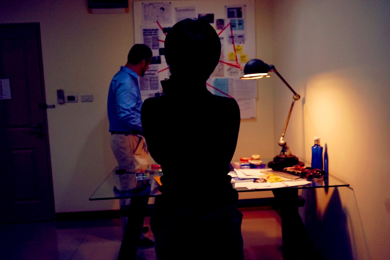
It was a very busy and tiring day both for me and my mother. We had to rush all over Bangkok that morning to work on several businesses. This results in having less time to work on my crime board and setting the place up. We ended up having only 30 minutes to get our location ready before having to head off to dinner with Mr. Williams. The tapes we bought did not work well with a 'foam' crime board, therefore, I need to make a run to Seven Eleven to get us a new set of tape.


And water...


Our crime board process:


It was very fun yet tiring. My brother was not in a very good mood that day due to all the filming he needed to do throughout the morning and the afternoon. However, the fact that he had been practicing all morning had left him in a good performing 'state of mind' and it didn't took us long to get what we wanted. Towards the end of the day, he was more than happy to film again.


("Who is Emily Warhol? Is she somehow related to Andy Warhol?", "Erm... I just combine random names that comes to my head at the time. If you pay enough attention to read what's on there, you'll find even weirder things.") 


("I'm Deadpool, do I have to remind you?")

Bloopers and Out-takes: