Although I have finished the editing and color grading of the sequence, I still wanted to know how differently the scene would turn out if I have used another color palette. Below are my experimented samples:
After the first edit (the rough cut), the majority of my friends said that the Apartment scene's palette is too orangey vibrant. Therefore, to solve the problem (and because I am a person who just love colors), I asked my parents and my brother to watch me color grade the outcome. At first, I tried using two contrasting colors to color grade. The outcome was pretty nice, however, it did gives a feeling of this being a fantasy-dreamland-adventure type of movie. As a result, I lowered the opacity of the adjustment layer in which I worked on in Premiere to get the final outcome.
What I found is that two contrasting colors help creates a sense of depth in the footage, outlining distinct shadows.

(This is the one I chose for the first editing)

(Red makes the scene looks more scary than friendly and safe. Although it can represents blood and murder, it is not suited for this particular scene.)

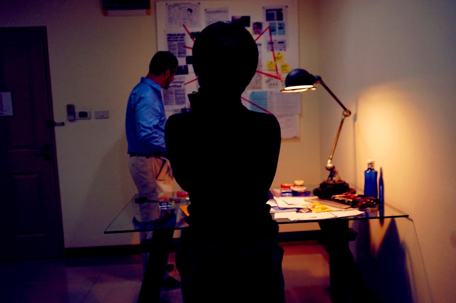
(Original footage, contrast and vignetted adjusted.)

(This palette resembles the Dream Sequence. It does not make the apartment ore Victor's presence seems safe for poor Scott at all.)

(The green palette gives off the same feeling with what I got from red. It represents the concept of danger and mischievous rather than the safe nest of home.)
No comments:
Post a Comment